


Packaging
Across every packaging project, the goal was the same: elevate everyday beauty tools and care products into premium, shelf-stopping experiences through intentional material selection, layered finishes, and brand-driven storytelling. From dramatic tactile exteriors and award-winning luxury finishes, to bold interior color reveals and intricate die-cut structures, each design was engineered to create an emotional first impression while reinforcing brand identity at retail. These projects demonstrate a consistent approach to premium packaging—where structure, surface, and color work together to communicate quality, credibility, and desire—resulting in industry recognition, standout shelf presence, and memorable unboxing moments.

Cortex Flat Iron Packaging
Every surface of the Cortex flat iron packaging was intentionally designed to reflect the brand’s professional prestige. The foundation began with a deep black textured paper, chosen for both its visual depth and tactile richness. The logo was executed in blind emboss for subtle dimension, then elevated with spot UV and silver foil accents that shimmered against the matte surface. A controlled hint of Cortex red was introduced as a striking brand cue—bold, confident, and unmistakable.
The final presentation delivered dramatic contrast, refined craftsmanship, and unmistakable salon-level luxury—earning a prestigious ADDY Award and being featured in Graphic Design USA’s Packaging Issue.

Cynthia Rowley Flat Iron Packaging
As a white-label project for Cynthia Rowley, the goal was to seamlessly translate her distinctive fashion brand into the beauty tool category. The packaging leveraged her signature Tiffany blue and gold to establish instant brand recognition, while a bold interior reveal—pink or purple depending on the flat iron color—created a memorable, color-driven unboxing experience. This balance of polished luxury and playful expression aligned perfectly with the Cynthia Rowley brand DNA while elevating the product’s perceived value at retail.
The design was recognized with an Addy® Award and featured in Graphic Design USA’s Packaging Issue and on The Dieline.
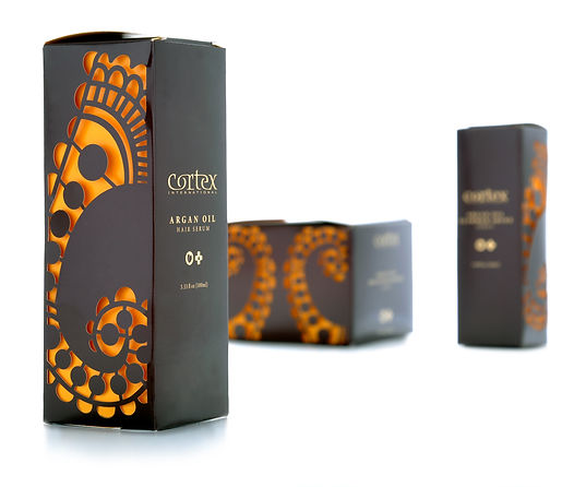
Cortex Argan Oil and Wet Line
Every detail of the Cortex Argan Oil and Wet Line packaging was crafted to tell a visual story of richness, warmth, and premium care. A deep brown exterior created an immediate sense of heritage and luxury, while an intricate henna-inspired die-cut pattern revealed glimpses of the inner packaging beneath. The interior “safe” box was executed in warm yellow-orange tones—both to protect the product and to evoke the natural warmth of argan oil itself. This layered approach blended function with visual drama, turning protection into part of the design experience and elevating the line’s shelf presence with depth, texture, and authenticity.